Séance 10
Objectifs
Comprendre les principes du responsive design.
Être capable d’adapter un site pour différents écrans.
Méthode :
L'objectif du Responsive Web Design est de garantir qu'un unique site web offre la meilleure expérience possible à tous les utilisateurs, quel que soit leur appareil (téléphone, tablette, ordinateur).
Le site doit s'adapter automatiquement pour rester lisible et fonctionnel partout.
Voici les concepts clés à intégrer pour que votre site devienne responsive.
1. L'approche "Mobile First" (Le mobile d'abord)
C'est la stratégie la plus importante. Au lieu de concevoir un site complexe pour ordinateur et d'essayer ensuite de "réduire" les choses pour un téléphone (ce qui est difficile), nous faisons l'inverse :
Nous concevons d'abord la version la plus simple pour les petits écrans mobiles.
Ensuite, nous ajoutons des fonctionnalités et des colonnes à mesure que l'écran s'agrandit.
2. Les Mises en Page Fluides
Nous arrêtons de penser en pixels fixes (ex: width: 960px;). Nous utilisons des unités flexibles qui peuvent "grandir" ou "rétrécir" :
Les pourcentages (
%) :width: 100%signifie "prends toute la largeur de ton parent".Les unités de "viewport" (
vw) :1vwéquivaut à 1% de la largeur de la fenêtre du navigateur.Flexbox et CSS Grid : Ce sont des outils CSS modernes conçus spécifiquement pour créer des mises en page complexes et flexibles.
3. Les Médias Fluides
Une image trop grande est la cause n°1 d'un site "cassé" sur mobile (obligeant l'utilisateur à zoomer en arrière). La solution est une simple règle CSS qui dit à toutes les images : "Ne sois jamais plus large que le conteneur dans lequel tu te trouves".
img, video {
  max-width: 100%;
  height: auto;
}
4. Les Typographie Fluide avec clamp()
C'est une amélioration moderne de la typographie responsive. Au lieu de "sauts" de police (petite taille sur mobile, grande taille sur desktop), nous avons une croissance fluide.
h1 {
  font-size: clamp(2rem, 1.75rem + 1vw, 2.5rem);
}
La police des
h1ne sera jamais plus petite que2rem(le minimum).Elle ne sera jamais plus grande que
2.5rem(le maximum).Entre ces deux bornes, elle grandira en douceur en fonction de la largeur de l'écran (grâce à
1.75rem + 1vw).
5. Les Media Queries (Points de Rupture)
C'est la "magie" du responsive. Une media query est une règle CSS qui dit : "SI l'écran fait (au moins) telle largeur, ALORS applique ces styles."
Cela permet de changer radicalement la mise en page à des "points de rupture" définis (par exemple, 768px pour les tablettes). C'est ainsi qu'un site passe d'une seule colonne sur mobile à trois colonnes sur ordinateur.
/* Styles de base (Mobile First) */.colonne { width: 100%; }
/* Point de rupture pour les écrans plus grands */@media (min-width: 768px) {
.colonne { width: 33%; }
}
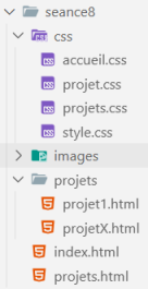
Méthode : Arborescence
Méthode : index.html
<html lang="fr">
<head>
<meta charset="UTF-8">
<meta name="viewport" content="width=device-width, initial-scale=1.0">
<title>Portfolio de Vincent Vanneste</title>
<link rel="stylesheet" href="css/style.css">
<link rel="stylesheet" href="css/accueil.css">
<!-- Import de polices externes (Google Fonts) --><link
href="https://fonts.googleapis.com/css2?family=Poppins:wght@400;500;600&family=Roboto:wght@400;700&display=swap"
rel="stylesheet">
<!-- Font Awesome CDN pour icônes --><link rel="stylesheet" href="https://cdnjs.cloudflare.com/ajax/libs/font-awesome/6.6.0/css/all.min.css">
</head>
<body>
<header id="haut" aria-label="En-tête du site">
<figure aria-labelledby="figcaption-vv">
<img src="images/photo.jpg" alt="Photo de Vincent Vanneste">
<figcaption id="figcaption-vv">Vincent Vanneste</figcaption>
</figure>
<h1>Portfolio de Vincent Vanneste</h1>
<nav aria-label="Navigation principale">
<ul>
<li><a href="index.html">Accueil</a></li>
<li><a href="projets.html">Projets</a></li>
<li><a href="https://www.univ-littoral.fr/" target="_blank">ULCO</a></li>
</ul>
</nav>
</header>
<main aria-label="Contenu principal du site">
<nav aria-label="Navigation interne à la page">
<ul>
<li><a href="#about">À propos</a></li>
<li><a href="#competences">Compétences</a></li>
<li><a href="#experiences">Expériences</a></li>
<li><a href="#formations">Formations</a></li>
</ul>
</nav>
<!-- À propos --><section id="about" aria-labelledby="titre-about">
<h2 class="icon-about" id="titre-about">À propos</h2>
<p>Je suis directeur des études du DEUST WMI de Calais et j'enseigne les fondamentaux du développement web
(HTML, CSS, JavaScript, PHP). Passionné par la transmission des connaissances, j'accompagne mes
étudiants dans l'acquisition des compétences nécessaires pour réussir dans le secteur du numérique.</p>
<address role="contentinfo" aria-label="Coordonnées">
<dl>
<dt>Localisation :</dt>
<dd>Calais, France</dd>
<dt>Site :</dt>
<dd><a href="https://vincent-vanneste.fr/" target="_blank">vincent-vanneste.fr</a></dd>
<dt>Email :</dt>
<dd><a href="mailto:vincent.vanneste@univ-littoral.fr">vincent.vanneste@univ-littoral.fr</a></dd>
</dl>
</address>
</section>
<!-- Compétences --><section id="competences" aria-labelledby="titre-competences">
<h2 class="icon-competences" id="titre-competences">Compétences</h2>
<ul>
<li>HTML</li>
<li>CSS</li>
<li>Responsive</li>
<li>Accessibilité</li>
<li>JavaScript</li>
<li>PHP • Laravel 11</li>
<li>MySQL</li>
<li>Git & GitHub</li>
</ul>
</section>
<!-- Expériences --><section id="experiences" aria-labelledby="titre-experiences">
<h2 class="icon-experiences" id="titre-experiences">Expériences récentes</h2>
<ul>
<li>
<strong>Enseignant – Licence 1 Informatique</strong><br>
<time datetime="2025">2025</time> •
<address>
<a href="https://www.univ-littoral.fr/" target="_blank">ULCO</a>
</address><br>
Introduction à HTML, CSS, JS
</li>
<li>
<strong>Directeur des études – DEUST WMI</strong><br>
depuis <time datetime="2024">2024</time> •
<address>
<a href="https://www.univ-littoral.fr/" target="_blank">FCU ULCO</a>
</address>
</li>
</ul>
</section>
<!-- Formations --><section id="formations" aria-labelledby="titre-formations">
<h2 class="icon-formations" id="titre-formations">Formations</h2>
<ul>
<li>
<strong>Doctorat productique, automatique et informatique industrielle</strong><br>
<time datetime="2000">2000</time> •
<address>
<a href="https://www.univ-lille.fr/" target="_blank">Université de Lille</a>
</address>
</li>
<li>
<strong>CAPET Technologie</strong><br>
<time datetime="1998">1998</time> •
<address>
<a href="https://www.iufm-douai.fr/" target="_blank">IUFM Douais</a>
</address>
</li>
</ul>
</section>
</main>
<footer aria-label="Pied de page">
<p>© 2025 <strong>Vincent Vanneste</strong>. Tous droits réservés.</p>
<!-- Réseaux sociaux --><div class="socials" role="navigation" aria-label="Réseaux sociaux">
<a href="https://www.facebook.com/" target="_blank" aria-label="Facebook">
<i class="fab fa-facebook-f"></i>
</a>
<a href="https://www.linkedin.com/in/" target="_blank" aria-label="LinkedIn">
<i class="fab fa-linkedin-in"></i>
</a>
<a href="https://www.instagram.com/" target="_blank" aria-label="Instagram">
<i class="fab fa-instagram"></i>
</a>
<a href="https://x.com/" target="_blank" aria-label="X">
<i class="fab fa-x-twitter"></i>
</a>
</div>
</footer>
</body>
</html>
Méthode : projets.html
<html lang="fr">
<head>
<meta charset="UTF-8">
<meta name="viewport" content="width=device-width, initial-scale=1.0">
<title>Portfolio - Projets</title>
<link rel="stylesheet" href="css/style.css">
<link rel="stylesheet" href="css/projets.css">
<!-- Import de polices externes (Google Fonts) --><link
href="https://fonts.googleapis.com/css2?family=Poppins:wght@400;500;600&family=Roboto:wght@400;700&display=swap"
rel="stylesheet">
<!-- Font Awesome CDN pour icônes --><link rel="stylesheet" href="https://cdnjs.cloudflare.com/ajax/libs/font-awesome/6.6.0/css/all.min.css">
</head>
<body>
<header id="haut" aria-label="En-tête du site">
<figure aria-labelledby="figcaption-vv">
<img src="images/photo.jpg" alt="Photo de Vincent Vanneste">
<figcaption id="figcaption-vv">Vincent Vanneste</figcaption>
</figure>
<h1>Portfolio de Vincent Vanneste</h1>
<nav aria-label="Navigation principale">
<ul>
<li><a href="index.html">Accueil</a></li>
<li><a href="projets.html">Projets</a></li>
<li><a href="https://www.univ-littoral.fr/" target="_blank">ULCO</a></li>
</ul>
</nav>
</header>
<main>
<section aria-labelledby="liste-projets" class="projets">
<h2 id="liste-projets">Liste des projets</h2>
<article aria-labelledby="titre-projet1">
<h3 id="titre-projet1"><a href="projets/projet1.html">Projet 1</a></h3>
<figure aria-labelledby="fig-projet1">
<img src="images/vignettes/projet1.jpg" alt="Aperçu du Projet 1">
<figcaption id="fig-projet1">Aperçu du Projet 1</figcaption>
</figure>
<p>Un projet qui présente les bases du HTML et de la mise en page.</p>
</article>
<article aria-labelledby="titre-projet2">
<h3 id="titre-projet2"><a href="projets/projet2.html">Projet 2</a></h3>
<figure aria-labelledby="fig-projet2">
<img src="images/vignettes/projet2.jpg" alt="Aperçu du Projet 2">
<figcaption id="fig-projet2">Aperçu du Projet 2</figcaption>
</figure>
<p>Un site en CSS avec une mise en forme responsive adaptée aux mobiles.</p>
</article>
<article aria-labelledby="titre-projet3">
<h3 id="titre-projet3"><a href="projets/projet3.html">Projet 3</a></h3>
<figure aria-labelledby="fig-projet3">
<img src="images/vignettes/projet3.jpg" alt="Aperçu du Projet 3">
<figcaption id="fig-projet3">Aperçu du Projet 3</figcaption>
</figure>
<p>Un mini-site en JavaScript avec des interactions simples.</p>
</article>
<article aria-labelledby="titre-projet4">
<h3 id="titre-projet4"><a href="projets/projet4.html">Projet 4</a></h3>
<figure aria-labelledby="fig-projet4">
<img src="images/vignettes/projet4.jpg" alt="Aperçu du Projet 4">
<figcaption id="fig-projet4">Aperçu du Projet 4</figcaption>
</figure>
<p>Une application web utilisant PHP et MySQL pour gérer des données.</p>
</article>
<article aria-labelledby="titre-projet5">
<h3 id="titre-projet5"><a href="projets/projet5.html">Projet 5</a></h3>
<figure aria-labelledby="fig-projet5">
<img src="images/vignettes/projet5.jpg" alt="Aperçu du Projet 5">
<figcaption id="fig-projet5">Aperçu du Projet 5</figcaption>
</figure>
<p>Un projet complet combinant HTML, CSS, JS et base de données.</p>
</article>
</section>
</main>
<footer aria-label="Pied de page">
<p>© 2025 <strong>Vincent Vanneste</strong>. Tous droits réservés.</p>
<!-- Réseaux sociaux --><div class="socials" role="navigation" aria-label="Réseaux sociaux">
<a href="https://www.facebook.com/" target="_blank" aria-label="Facebook">
<i class="fab fa-facebook-f"></i>
</a>
<a href="https://www.linkedin.com/in/" target="_blank" aria-label="LinkedIn">
<i class="fab fa-linkedin-in"></i>
</a>
<a href="https://www.instagram.com/" target="_blank" aria-label="Instagram">
<i class="fab fa-instagram"></i>
</a>
<a href="https://x.com/" target="_blank" aria-label="X">
<i class="fab fa-x-twitter"></i>
</a>
</div>
</footer>
</body>
</html>
Méthode : projets/projet1.html
<html lang="fr">
<head>
<base href="../">
<meta charset="UTF-8">
<meta name="viewport" content="width=device-width, initial-scale=1.0">
<title>Projet 1 - Portfolio de Vincent Vanneste</title>
<link rel="stylesheet" href="css/style.css">
<link rel="stylesheet" href="css/projet.css">
<!-- Google Fonts --><link
href="https://fonts.googleapis.com/css2?family=Poppins:wght@400;500;600&family=Roboto:wght@400;700&display=swap"
rel="stylesheet">
<!-- Font Awesome --><link rel="stylesheet" href="https://cdnjs.cloudflare.com/ajax/libs/font-awesome/6.6.0/css/all.min.css">
</head>
<body>
<header id="haut" aria-label="En-tête du site">
<figure aria-labelledby="figcaption-vv">
<img src="images/photo.jpg" alt="Photo de Vincent Vanneste">
<figcaption id="figcaption-vv">Vincent Vanneste</figcaption>
</figure>
<h1>Portfolio de Vincent Vanneste</h1>
<nav aria-label="Navigation principale">
<ul>
<li><a href="index.html">Accueil</a></li>
<li><a href=".projets.html">Projets</a></li>
<li><a href="https://www.univ-littoral.fr/" target="_blank">ULCO</a></li>
</ul>
</nav>
</header>
<main>
<article aria-labelledby="titre-projet1" class="projets">
<header>
<h2 id="titre-projet1">Projet 1 <br> Découverte du HTML et du CSS</h2>
<figure>
<img src="images/projet1.jpg" alt="Capture d’écran du Projet 1">
<figcaption>Page d’accueil du projet HTML/CSS</figcaption>
</figure>
</header>
<section aria-labelledby="description-projet">
<h2 id="description-projet">Description du projet</h2>
<p>
Ce premier projet consiste à créer un mini-site en HTML et CSS.
L’objectif est de comprendre la structure d’une page web,
d’utiliser les balises sémantiques et d’appliquer les premières règles de style CSS.
</p>
</section>
<section aria-labelledby="objectifs-projet">
<h2 id="objectifs-projet">Objectifs pédagogiques</h2>
<ul>
<li>Découvrir la structure d’un document HTML5.</li>
<li>Apprendre à organiser un site web avec plusieurs pages liées.</li>
<li>Utiliser le CSS pour la mise en forme du contenu.</li>
<li>Publier le site sur GitHub Pages.</li>
</ul>
</section>
<section aria-labelledby="competences-visees">
<h2 id="competences-visees">Compétences visées</h2>
<ul>
<li>Structurer et organiser un site web en utilisant le HTML sémantique et les bonnes pratiques de
codage.</li>
<li>Mettre en forme et personnaliser l’apparence d’un site avec le CSS (Flexbox, Grid, couleurs,
polices, effets).</li>
<li>Créer un portfolio complet avec une navigation cohérente.</li>
<li>Intégrer des contenus multimédias accessibles et esthétiques.</li>
<li>Adapter un site aux différents écrans grâce au responsive design et aux media queries.</li>
<li>Déployer un site en ligne via GitHub Pages et le valider (W3C, Lighthouse).</li>
<li>Présenter et valoriser son travail avec une identité graphique cohérente.</li>
</ul>
</section>
<section aria-labelledby="resultat-projet">
<h2 id="resultat-projet">Résultat obtenu</h2>
<p>
Le projet final se compose d’une page d’accueil, d’une galerie de projets et d'une page par projet.
Le site est responsive et conforme aux standards du W3C.
</p>
<p>
<a href="" class="btn" target="_blank" rel="noopener">
<i class="fa-solid fa-eye"></i> Voir la démo
</a>
</p>
</section>
<nav class="nav-projets" aria-label="Navigation entre les projets">
<a href="projets/projet2.html" class="next">Projet suivant →</a>
</nav>
</article>
</main>
<footer aria-label="Pied de page">
<p>© 2025 <strong>Vincent Vanneste</strong>. Tous droits réservés.</p>
<!-- Réseaux sociaux --><div class="socials" role="navigation" aria-label="Réseaux sociaux">
<a href="https://www.facebook.com/" target="_blank" aria-label="Facebook">
<i class="fab fa-facebook-f"></i>
</a>
<a href="https://www.linkedin.com/in/" target="_blank" aria-label="LinkedIn">
<i class="fab fa-linkedin-in"></i>
</a>
<a href="https://www.instagram.com/" target="_blank" aria-label="Instagram">
<i class="fab fa-instagram"></i>
</a>
<a href="https://x.com/" target="_blank" aria-label="X">
<i class="fab fa-x-twitter"></i>
</a>
</div>
</footer>
</body>
</html>
Méthode : css/style.css
/* ========================================================================== CSS Général ========================================================================== *//* --- Corps de la page --- */body { /***************/ /* Typographie */ /***************/font-family: 'Poppins', Arial, sans-serif;
color: #222;
line-height: 1.5;
/* MODIFIÉ : Typographie fluide pour tout le corps du texte */ /* MIN, PRÉFÉRÉ (base + fluidité), MAX */font-size: clamp(0.95rem, 0.9rem + 0.2vw, 1.1rem);
/**********************/ /* Boîte & Espacement */ /**********************/margin: 0;
/****************************/ /* Couleurs & Arrière-plans */ /****************************/background: linear-gradient(135deg, #e8f0ff 0%, #f9fcff 100%);
/***************/ /* Transitions */ /***************/transition: background 0.5s ease;
}
/* --- Médias fluides (Images, Vidéos) --- *//* AJOUTÉ : Garantit que les médias ne dépassent jamais de leur conteneur */img,video,iframe {max-width: 100%;
height: auto;
}
/* ========================================================================== En-tête (Header) ========================================================================== */body>header {
/***************/ /* Typographie */ /***************/text-align: center;
color: white;
/**********************/ /* Boîte & Espacement */ /**********************/padding: 20px;
/****************************/ /* Couleurs & Arrière-plans */ /****************************/background: linear-gradient(135deg, #0073e6, #004a99);
/********************/ /* Bordures & Ombre */ /********************/border-bottom: 2px solid #ddd;
box-shadow: 0 4px 10px rgba(0, 0, 0, 0.15);
/* Transitions */transition: background 0.3s ease;
}
/* --- Titre principal du Header (h1) --- */body>header h1 {
/***************/ /* Typographie */ /***************/font-family: 'Roboto', sans-serif;
/* MODIFIÉ : Typographie fluide */ /* MIN, PRÉFÉRÉ (base + fluidité), MAX */font-size: clamp(2rem, 1.75rem + 1vw, 2.5rem);
letter-spacing: 0.5px;
text-shadow: 1px 1px 2px rgba(0, 0, 0, 0.25);
/**********************/ /* Boîte & Espacement */ /**********************/margin: 10px 0;
}
/* --- Figure dans le header --- */body>header figure {
/**********************/ /* Boîte & Espacement */ /**********************/margin: 0 auto 10px;
}
/* --- Image de profil --- */body>header img {
/**************/ /* Dimensions */ /**************/ /* MODIFIÉ : Taille par défaut pour mobile */width: 120px;
/********************/ /* Bordures & Ombre */ /********************/border-radius: 50%;
border: 3px solid #0066cc;
/***************/ /* Transitions */ /***************/transition: transform 0.3s ease, box-shadow 0.3s ease;
}
body>header img:hover {
/*******************/ /* Transformations */ /*******************/transform: scale(1.08) rotate(2deg);
/*********/ /* Ombre */ /*********/box-shadow: 0 4px 12px rgba(0, 0, 0, 0.3);
}
/* --- Légende de l'image de profil --- */body>header figcaption {
/***************/ /* Typographie */ /***************/ /* MODIFIÉ : Typographie fluide */font-size: clamp(0.85rem, 0.8rem + 0.2vw, 1rem);
/**********************/ /* Boîte & Espacement */ /**********************/margin-top: 8px;
}
/* --- Navigation principale (dans le header) --- */body>header nav ul {
/***********/ /* Flexbox */ /***********/display: flex;
/* MODIFIÉ : Styles "Mobile First" */flex-direction: column;
align-items: center;
gap: 10px;
/**********************/ /* Boîte & Espacement */ /**********************/padding: 0;
margin: 10px 0 0;
/******************/ /* Style de liste */ /******************/list-style: none;
}
/* --- Liens de navigation principale (dans le header) --- */body>header nav a {
/***************/ /* Typographie */ /***************/text-decoration: none;
color: #bfc5cb;
font-weight: bold;
/* La taille de la police sera héritée du 'body' fluide */ /**********************/ /* Boîte & Espacement */ /**********************/padding: 6px 10px;
/************/ /* Bordures */ /************/border-radius: 4px;
/******************/ /* Positionnement */ /******************/position: relative;
overflow: hidden;
/***************/ /* Transitions */ /***************/transition: color 0.3s ease;
}
body>header nav a:hover {
/************/ /* Couleurs */ /************/background-color: #ddd;
color: #333;
}
/* --- Barre animée sous le lien (pseudo-élément) --- */body>header nav a::after {
content: "";
position: absolute;
bottom: 0;
left: 0;
width: 0%;
height: 3px;
background: white;
transition: width 0.3s ease;
}
/* --- Effet sur le survol de la barre de navigation --- */body>header nav a:hover::after {
width: 100%;
}
/* --- Effet de clic sur l’élément li du header --- */body>header nav li:active {
/*******************/ /* Transformations */ /*******************/transform: scale(0.9);
}
/* ========================================================================== Contenu principal (Main) ========================================================================== */main { /**********************/ /* Boîte & Espacement */ /**********************/max-width: 1000px;
margin: auto;
}
/* --- Titre principal du main (h1) --- */main>h1 {
/***************/ /* Typographie */ /***************/text-align: center;
color: #1e3a5f;
/* MODIFIÉ : Typographie fluide */ /* MIN, PRÉFÉRÉ (base + fluidité), MAX */font-size: clamp(2rem, 1.8rem + 0.5vw, 2.2rem);
/**********************/ /* Boîte & Espacement */ /**********************/margin: 20px 0;
}
/* --- Sections et articles principaux du main --- */main>section,
main>article {
/**********************/ /* Boîte & Espacement */ /**********************/padding: 0 15px;
}
/* --- Titres de section et d'article (h2) --- */main>section h2,
main>article h2 {
/***************/ /* Typographie */ /***************/color: #1e3a5f;
/* MODIFIÉ : Typographie fluide */ /* MIN, PRÉFÉRÉ (base + fluidité), MAX */font-size: clamp(1.25rem, 1.1rem + 0.5vw, 1.5rem);
}
/* ========================================================================== Pied de page (Footer) ========================================================================== */footer { /***************/ /* Typographie */ /***************/color: #fff;
text-align: center;
/* La taille de police est héritée du 'body' fluide */ /**********************/ /* Boîte & Espacement */ /**********************/padding: 20px;
/****************************/ /* Couleurs & Arrière-plans */ /****************************/background: linear-gradient(135deg, #1e3a5f, #0a2340, #224c80, #162d50);
background-size: 200% 200%;
/***************/ /* Transitions */ /***************/transition: background-position 0.5s ease;
}
footer:hover {
background-position: right bottom;
}
footer p {
/**********************/ /* Boîte & Espacement */ /**********************/margin: 0;
}
/* --- Réseaux sociaux dans le footer --- */footer .socials {
/***********/ /* Flexbox */ /***********/display: flex;
justify-content: center;
gap: 20px;
/**********************/ /* Boîte & Espacement */ /**********************/margin-top: 15px;
}
footer .socials a {
/***************/ /* Typographie */ /***************/ /* MODIFIÉ : Typographie fluide pour les icônes */font-size: clamp(1.5rem, 1.4rem + 0.5vw, 1.75rem);
/* 28px max */color: white;
/***************/ /* Transitions */ /***************/transition: transform 0.3s ease, color 0.3s ease;
}
footer .socials a:hover {
/*******************/ /* Transformations */ /*******************/transform: translateY(-3px) scale(1.2);
/************/ /* Couleurs */ /************/color: #00a2ff;
}
/* ========================================================================== AJOUTÉ : Styles Responsives (Tablettes et Ordinateurs) ========================================================================== *//* S'applique à 768px OU PLUS */@media (min-width: 768px) {
/* --- On restaure la taille de l'image de profil --- */body>header img {
width: 150px;
}
/* --- On restaure la navigation horizontale --- */body>header nav ul {
flex-direction: row;
justify-content: center;
gap: 15px;
}
/* * Remarque : * Plus besoin de changer les font-size, * car clamp() s'en occupe déjà sur toute la page ! */}
Méthode : css/accueil.css
/* ========================================================================== Mise en page Grid (Contenu principal) ========================================================================== */main { /***********************/ /* Mise en page (Grid) */ /***********************/display: grid;
/* MODIFIÉ : "Mobile First" (1 colonne par défaut) */ /* L'ancienne grille (3 colonnes) est déplacée dans la media query */grid-template-columns: 1fr;
grid-template-areas: "nav" "about" "competences" "experiences" "formations"; /**********************/ /* Boîte & Espacement */ /**********************/gap: 10px;
}
/* --- Assignation des zones de la grille --- *//* (Ceci fonctionne maintenant pour la grille mobile ET la grille desktop) */main>nav {
grid-area: nav;
}
#about {grid-area: about;
}
#competences {grid-area: competences;
}
#experiences {grid-area: experiences;
}
#formations {grid-area: formations;
}
/* ========================================================================== Navigation Interne (dans Main) ========================================================================== *//* --- Liste de la navigation interne --- */main nav ul {
/***********/ /* Flexbox */ /***********/display: flex;
justify-content: center;
flex-wrap: wrap;
/* 'flex-wrap: wrap' est déjà excellent pour le responsive ! */ /**********************/ /* Boîte & Espacement */ /**********************/gap: 12px;
padding: 0;
margin: 20px 0;
/******************/ /* Style de liste */ /******************/list-style: none;
}
/* --- Liens de la navigation interne --- */main nav a {
/**********************/ /* Boîte & Espacement */ /**********************/display: inline-block;
padding: 6px 12px;
/***************/ /* Typographie */ /***************/text-decoration: none;
color: #fff;
font-weight: bold;
/* La taille de la police est héritée du 'body' (défini dans l'autre fichier) */ /****************************/ /* Couleurs & Arrière-plans */ /****************************/background-color: #0073e6;
/************/ /* Bordures */ /************/border-radius: 6px;
/***************/ /* Transitions */ /***************/transition: transform 0.2s ease;
}
/* --- Survol des liens de navigation interne --- */main nav a:hover {
/****************************/ /* Couleurs & Arrière-plans */ /****************************/background: linear-gradient(135deg, #0073e6, #00a2ff);
/*******************/ /* Transformations */ /*******************/transform: translateY(-3px) scale(1.05);
}
/* --- Focus (accessibilité) des liens de navigation interne --- */main nav a:focus {
/*********************/ /* Accessibilité (Focus) */ /*********************/outline: 3px solid #005bb5;
outline-offset: 2px;
}
/* ========================================================================== Sections de Contenu ========================================================================== *//* --- Style général des sections --- */section { /***********************/ /* Animation & Effets */ /***********************/opacity: 0;
transform: translateY(15px);
animation: fadeIn 0.8s ease forwards;
}
/* --- Titres de section (h2) --- */section h2 {
/***************/ /* Typographie */ /***************/ /* MODIFIÉ : Typographie fluide */ /* font-size: 1.5rem; <-- Remplacé par clamp() */ /* MIN, PRÉFÉRÉ (base + fluidité), MAX */font-size: clamp(1.25rem, 1.1rem + 0.5vw, 1.5rem);
color: #1e3a5f;
/**********************/ /* Boîte & Espacement */ /**********************/margin-top: 30px;
margin-bottom: 10px;
padding-bottom: 5px;
/************/ /* Bordures */ /************/border-bottom: 2px solid #ddd;
}
/* --- Paragraphes de section --- */section p {
/**********************/ /* Boîte & Espacement */ /**********************/margin-bottom: 15px;
/* La taille de la police est héritée du 'body' fluide */}
/* ========================================================================== Éléments de Contenu (Listes, Liens, Adresse) ========================================================================== *//* --- Listes à puces (dans section) --- */section ul {
/**********************/ /* Boîte & Espacement */ /**********************/padding-left: 20px;
margin-bottom: 20px;
}
/* --- Éléments de liste (dans section) --- */section li {
/**********************/ /* Boîte & Espacement */ /**********************/margin-bottom: 8px;
}
/* --- Liens (dans section) --- */section a {
/***************/ /* Typographie */ /***************/color: #0066cc;
text-decoration: none;
}
section a:hover {
/***************/ /* Typographie */ /***************/text-decoration: underline;
}
/* --- Balise Adresse --- */address { /***************/ /* Typographie */ /***************/font-style: normal;
/**********************/ /* Boîte & Espacement */ /**********************/display: inline;
}
/* ========================================================================== Classes Utilitaires (Icônes) ========================================================================== *//* --- Base des icônes (pseudo-élément) --- */.icon-about::before,
.icon-competences::before,
.icon-experiences::before,
.icon-formations::before {
/**********************/ /* Boîte & Espacement */ /**********************/margin-right: 8px;
}
/* --- Icônes spécifiques (Emoji) --- */.icon-about::before {
content: "👤";
}
.icon-competences::before {
content: "💻";
}
.icon-experiences::before {
content: "📅";
}
.icon-formations::before {
content: "🎓";
}
/* ========================================================================== Animations ========================================================================== *//* --- Délais d'animation pour les sections --- */section:nth-of-type(2) {
animation-delay: 0.2s;
}
section:nth-of-type(3) {
animation-delay: 0.4s;
}
section:nth-of-type(4) {
animation-delay: 0.6s;
}
/* --- Définition de l’animation fadeIn --- */@keyframes fadeIn {
to {opacity: 1;
transform: translateY(0);
}
}
/* ========================================================================== AJOUTÉ : Styles Responsives (Tablettes et Ordinateurs) ========================================================================== *//* S'applique à 768px OU PLUS (Vous pouvez changer 768px pour 992px si vous préférez que la grille à 3 colonnes n'apparaisse que sur les écrans plus larges) */@media (min-width: 768px) {
main { /* Restaure la mise en page 3 colonnes pour les grands écrans */grid-template-columns: 1fr 1fr 1fr;
grid-template-areas: "nav nav nav" "about about about" "competences experiences formations";}
/* (Les typographies fluides et autres styles s'adaptent déjà) */}
Méthode : css/projets.css
/* ========================================================================== Mise en page de la Grille "Projets" ========================================================================== */.projets { /***********************/ /* Mise en page (Grid) */ /***********************/display: grid;
/* C'est déjà parfaitement responsive ! Excellent travail. */grid-template-columns: repeat(auto-fit, minmax(300px, 1fr));
/**********************/ /* Boîte & Espacement */ /**********************/gap: 20px;
}
/* ========================================================================== Titre Principal de la Section "Projets" ========================================================================== */.projets>h2 {
/***********************/ /* Mise en page (Grid) */ /***********************/grid-column: 1 / -1;
/***************/ /* Typographie */ /***************/text-align: center;
/* MODIFIÉ : Typographie fluide */ /* font-size: 1.8rem; <-- Remplacé par clamp() */ /* MIN, PRÉFÉRÉ (base + fluidité), MAX */font-size: clamp(1.5rem, 1.3rem + 1vw, 1.8rem);
font-weight: 600;
/**********************/ /* Boîte & Espacement */ /**********************/padding-bottom: 5px;
/************/ /* Bordures */ /************/border-bottom: 2px solid #ccc;
}
/* ========================================================================== Cartes de Projet (Article) ========================================================================== *//* --- Style de base des articles --- */.projets>article {
/**********************/ /* Boîte & Espacement */ /**********************/padding: 10px;
/****************************/ /* Couleurs & Arrière-plans */ /****************************/background: linear-gradient(135deg, #ffffff 0%, #f0f8ff 25%, #d0f0ff 50%, #f0f8ff 75%, #ffffff 100%);
background-size: 300% 300%;
/********************/ /* Bordures & Ombre */ /********************/border: 1px solid #ddd;
border-radius: 8px;
box-shadow: 0 2px 6px rgba(0, 0, 0, 0.1);
/***************/ /* Typographie */ /***************/text-align: left;
/******************/ /* Positionnement */ /******************/position: relative;
/***************/ /* Transitions */ /***************/transition: transform 0.3s ease, box-shadow 0.3s ease;
}
/* --- Survol des articles --- */.projets>article:hover {
/*******************/ /* Transformations */ /*******************/transform: translateY(-5px);
/********************/ /* Bordures & Ombre */ /********************/box-shadow: 0 8px 20px rgba(0, 0, 0, 0.2);
/*************/ /* Animation */ /*************/animation: gradientMove 3s linear infinite;
}
/* ========================================================================== Contenu des Cartes (Typo, Images, Liens) ========================================================================== *//* --- Titres des projets (h3) --- */.projets h3 {
/**********************/ /* Boîte & Espacement */ /**********************/margin-top: 0;
/***************/ /* Typographie */ /***************/ /* MODIFIÉ : Typographie fluide */ /* font-size: 1.1rem; <-- Remplacé par clamp() */ /* MIN, PRÉFÉRÉ (base + fluidité), MAX */font-size: clamp(1rem, 0.95rem + 0.2vw, 1.1rem);
}
/* --- Paragraphes des projets --- */.projets p {
/***************/ /* Typographie */ /***************/ /* MODIFIÉ : Typographie fluide */ /* font-size: 0.9rem; <-- Remplacé par clamp() */ /* MIN, PRÉFÉRÉ (base + fluidité), MAX */font-size: clamp(0.85rem, 0.8rem + 0.2vw, 0.9rem);
color: #333;
}
/* --- Conteneur Figure (pour image) --- */.projets figure {
/**********************/ /* Boîte & Espacement */ /**********************/margin: 0;
padding: 0;
}
/* --- Images des projets (fusion des doublons) --- */.projets figure img {
/**************/ /* Dimensions */ /**************/width: 100%;
height: auto;
/**********************/ /* Boîte & Espacement */ /**********************/display: block;
margin-bottom: 8px;
/************/ /* Bordures */ /************/border-radius: 4px;
border: 1px solid #ccc;
/***************/ /* Transitions */ /***************/transition: transform 0.3s ease, box-shadow 0.3s ease;
}
/* --- Survol des images --- */.projets figure img:hover {
/*******************/ /* Transformations */ /*******************/transform: scale(1.05);
/********************/ /* Bordures & Ombre */ /********************/box-shadow: 0 4px 12px rgba(0, 0, 0, 0.25);
}
/* --- Légendes des images --- */.projets figure figcaption {
/***************/ /* Typographie */ /***************/ /* MODIFIÉ : Typographie fluide */ /* font-size: 0.85rem; <-- Remplacé par clamp() */ /* MIN, PRÉFÉRÉ (base + fluidité), MAX */font-size: clamp(0.8rem, 0.75rem + 0.2vw, 0.85rem);
color: #666;
text-align: center;
}
/* --- Liens des projets --- */.projets a {
/**********************/ /* Boîte & Espacement */ /**********************/display: inline-block;
/***************/ /* Typographie */ /***************/text-decoration: none;
color: #0066cc;
font-weight: bold;
/* La taille s'adaptera car elle hérite du 'p' qui est fluide */ /***************/ /* Transitions */ /***************/transition: color 0.3s ease, transform 0.2s ease;
}
/* --- Survol des liens --- */.projets a:hover {
/***************/ /* Typographie */ /***************/color: #004a99;
text-decoration: underline;
/*******************/ /* Transformations */ /*******************/transform: translateY(-2px) scale(1.05);
}
/* --- Focus (accessibilité) des liens --- */.projets a:focus {
/*********************/ /* Accessibilité (Focus) */ /*********************/outline: 3px solid #005bb5;
outline-offset: 2px;
}
/* ========================================================================== Animations (Keyframes) ========================================================================== *//* --- Animation du gradient au survol des cartes --- */@keyframes gradientMove {
0% {background-position: 0% 0%;
}
50% {background-position: 100% 100%;
}
100% {background-position: 0% 0%;
}
}
Méthode : css/projet.css
/* ========================================================================== En-tête d'Article ========================================================================== *//* --- Conteneur de l'en-tête (article>header) --- */article>header {
/**********************/ /* Boîte & Espacement */ /**********************/margin-bottom: 30px;
/* Espace sous le header pour séparer du contenu suivant */ /***************************/ /* Alignement & Typographie */ /***************************/text-align: center;
/* Centre le contenu horizontalement (texte, images, etc.) */}
/* --- Image de l'en-tête d'article --- */article>header img {
/**************/ /* Dimensions */ /**************/ /* C'est déjà parfaitement responsive ! */max-width: 100%;
height: auto;
/**********************/ /* Boîte & Espacement */ /**********************/margin-top: 20px;
/********************/ /* Bordures & Ombre */ /********************/border-radius: 8px;
box-shadow: 0 4px 8px rgba(0, 0, 0, 0.1);
}
/* ========================================================================== Titres de Section (H2) ========================================================================== *//* --- Style commun des H2 de section (avec icônes) --- */section h2 {
/***********/ /* Flexbox */ /***********/display: flex;
align-items: center;
/**********************/ /* Boîte & Espacement */ /**********************/gap: 0.5em;
margin-bottom: 1rem;
/***************/ /* Typographie */ /***************/ /* MODIFIÉ : Typographie fluide */ /* font-size: 1.5rem; <-- Remplacé par clamp() */ /* MIN, PRÉFÉRÉ (base + fluidité), MAX */font-size: clamp(1.25rem, 1.1rem + 0.5vw, 1.5rem);
}
/* ========================================================================== Icônes des Titres (Pseudo-éléments) ========================================================================== *//* --- Icône Description 📝 --- */#description-projet::before {
/***********************/ /* Contenu (Pseudo-élément) */ /***********************/content: "\1F4DD";
/* Emoji "Note" (📝) */}
/* --- Icône Objectifs 🎯 --- */#objectifs-projet::before {
/***********************/ /* Contenu (Pseudo-élément) */ /***********************/content: "\1F3AF";
/* Emoji "Cible" (🎯) */}
/* --- Icône Compétences 🛠️ --- */#competences-visees::before {
/***********************/ /* Contenu (Pseudo-élément) */ /***********************/content: "\1F6E0";
/* Emoji "Outils" (🛠️) */}
/* --- Icône Résultat ✅ --- */#resultat-projet::before {
/***********************/ /* Contenu (Pseudo-élément) */ /***********************/content: "\2705";
/* Emoji "Coche" (✅) */}
Exemple :
See the Pen Séance 10-index by Vincent-Vanneste (@vincent-vanneste) on CodePen.
Exemple :
See the Pen Séance 10-projets by Vincent-Vanneste (@vincent-vanneste) on CodePen.
Exemple :
See the Pen Séance 10-projet1 by Vincent-Vanneste (@vincent-vanneste) on CodePen.